Oil spills aren't the only things killing sea life and leaving dead zones in the ocean. It's just that one very big oil spill happens to be in the news today. Ironically, oil, or petroleum, produces something else that kills oceans with an even greater problem: plastic.
A swirling sea of plastic bags, bottles and other debris is growing in the North Pacific, and now another one has been found in the Atlantic. But how did they get there? And is there anything we can do to clean them up?
Phillippe Cousteau Jr., grandson of French explorer and ecologist Jacques-Yves Cousteau: "I could cut my leg off, I could cut my arm off, I could gouge my eye out, I'd still probably survive, but not very well. And that's what we're doing to our oceans."
But we are perhaps more to blame for this disaster than anyone, because of our utterly irresponsible demand for oil - our gas guzzling cars, our extravagant energy inefficient houses, our endless manufacture of plastics, our throw-away lifestyles. If we refuse to change our ways, we can only point the finger at ourselves. BP creates the supply because we create the demand. We are the market, we are the consequence, we are the fault.
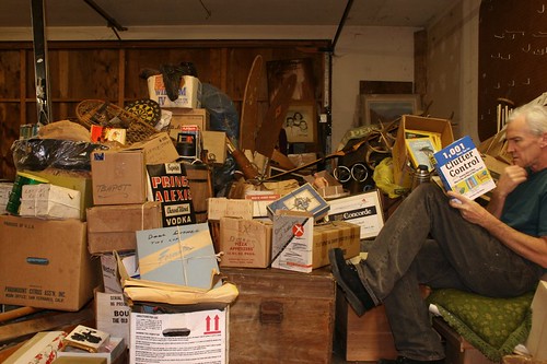
I have too much stuff. Most people in America do. In fact, the poorer people are, the more stuff they seem to have. Hardly anyone is so poor that they can't afford a front yard full of old cars.
It wasn't always this way. Stuff used to be rare and valuable. You can still see evidence of that if you look for it. For example, in my house in Cambridge, which was built in 1876, the bedrooms don't have closets. In those days people's stuff fit in a chest of drawers. Even as recently as a few decades ago there was a lot less stuff. When I look back at photos from the 1970s, I'm surprised how empty houses look. As a kid I had what I thought was a huge fleet of toy cars, but they'd be dwarfed by the number of toys my nephews have. All together my Matchboxes and Corgis took up about a third of the surface of my bed. In my nephews' rooms the bed is the only clear space.
Stuff has gotten a lot cheaper, but our attitudes toward it haven't changed correspondingly. We overvalue stuff.
That was a big problem for me when I had no money. I felt poor, and stuff seemed valuable, so almost instinctively I accumulated it. Friends would leave something behind when they moved, or I'd see something as I was walking down the street on trash night (beware of anything you find yourself describing as "perfectly good"), or I'd find something in almost new condition for a tenth its retail price at a garage sale. And pow, more stuff.
In fact these free or nearly free things weren't bargains, because they were worth even less than they cost. Most of the stuff I accumulated was worthless, because I didn't need it.
What I didn't understand was that the value of some new acquisition wasn't the difference between its retail price and what I paid for it. It was the value I derived from it. Stuff is an extremely illiquid asset. Unless you have some plan for selling that valuable thing you got so cheaply, what difference does it make what it's "worth?" The only way you're ever going to extract any value from it is to use it. And if you don't have any immediate use for it, you probably never will.
Companies that sell stuff have spent huge sums training us to think stuff is still valuable. But it would be closer to the truth to treat stuff as worthless.
In fact, worse than worthless, because once you've accumulated a certain amount of stuff, it starts to own you rather than the other way around. I know of one couple who couldn't retire to the town they preferred because they couldn't afford a place there big enough for all their stuff. Their house isn't theirs; it's their stuff's.
And unless you're extremely organized, a house full of stuff can be very depressing. A cluttered room saps one's spirits. One reason, obviously, is that there's less room for people in a room full of stuff. But there's more going on than that. I think humans constantly scan their environment to build a mental model of what's around them. And the harder a scene is to parse, the less energy you have left for conscious thoughts. A cluttered room is literally exhausting.
(This could explain why clutter doesn't seem to bother kids as much as adults. Kids are less perceptive. They build a coarser model of their surroundings, and this consumes less energy.)
I first realized the worthlessness of stuff when I lived in Italy for a year. All I took with me was one large backpack of stuff. The rest of my stuff I left in my landlady's attic back in the US. And you know what? All I missed were some of the books. By the end of the year I couldn't even remember what else I had stored in that attic.
And yet when I got back I didn't discard so much as a box of it. Throw away a perfectly good rotary telephone? I might need that one day.
The really painful thing to recall is not just that I accumulated all this useless stuff, but that I often spent money I desperately needed on stuff that I didn't.
Why would I do that? Because the people whose job is to sell you stuff are really, really good at it. The average 25 year old is no match for companies that have spent years figuring out how to get you to spend money on stuff. They make the experience of buying stuff so pleasant that "shopping" becomes a leisure activity.
How do you protect yourself from these people? It can't be easy. I'm a fairly skeptical person, and their tricks worked on me well into my thirties. But one thing that might work is to ask yourself, before buying something, "is this going to make my life noticeably better?"
A friend of mine cured herself of a clothes buying habit by asking herself before she bought anything "Am I going to wear this all the time?" If she couldn't convince herself that something she was thinking of buying would become one of those few things she wore all the time, she wouldn't buy it. I think that would work for any kind of purchase. Before you buy anything, ask yourself: will this be something I use constantly? Or is it just something nice? Or worse still, a mere bargain?
The worst stuff in this respect may be stuff you don't use much because it's too good. Nothing owns you like fragile stuff. For example, the "good china" so many households have, and whose defining quality is not so much that it's fun to use, but that one must be especially careful not to break it.
Another way to resist acquiring stuff is to think of the overall cost of owning it. The purchase price is just the beginning. You're going to have to think about that thing for years—perhaps for the rest of your life. Every thing you own takes energy away from you. Some give more than they take. Those are the only things worth having.
I've now stopped accumulating stuff. Except books—but books are different. Books are more like a fluid than individual objects. It's not especially inconvenient to own several thousand books, whereas if you owned several thousand random possessions you'd be a local celebrity. But except for books, I now actively avoid stuff. If I want to spend money on some kind of treat, I'll take services over goods any day.
I'm not claiming this is because I've achieved some kind of zenlike detachment from material things. I'm talking about something more mundane. A historical change has taken place, and I've now realized it. Stuff used to be valuable, and now it's not.
In industrialized countries the same thing happened with food in the middle of the twentieth century. As food got cheaper (or we got richer; they're indistinguishable), eating too much started to be a bigger danger than eating too little. We've now reached that point with stuff. For most people, rich or poor, stuff has become a burden.
The good news is, if you're carrying a burden without knowing it, your life could be better than you realize. Imagine walking around for years with five pound ankle weights, then suddenly having them removed.
May 24, 2010 [AP] The real estate listing for the house that went on the market Monday at 108 Ocean Ave. refers to it as a "legendary home," but most people would know the sideways Dutch Colonial on the canal as the so-called Amityville Horror house.
Listed for $1.15 million, the picturesque and pristine home looks very different from the home where Ronald DeFeo Jr. murdered six family members as they slept in 1974. The 28 supposedly haunted days in the house experienced by subsequent owners George and Kathleen Lutz spawned the 1977 bestselling Jay Anson book "The Amityville Horror: A True Story" and a series of scary movies about alleged supernatural happenings at the house starting in 1979.
First you paint. No, first you choose paint. So for some of us, that's where it ends. It's daunting. Here's help from around the web to find the right white.
NEW STUFF! Since posting this two years ago, it has become one of the most visited pages on my blog. Looks like more than a few of us need help finding the right white. So I've added some things, corrected some things, updated some things, and hopefully this will make paint picking a little easier. Let me know how it goes.
Anna Dorfman of Door Sixteen takes us through the step-by-step process she used to paint her floors white. Anna leaves no floorboard unturned. She includes her product line up and lots of great photos - before, during and after. By the way, two of her favorite whites are Benjamin Moore's Moonlight White and Simply White. After seeing pictures of her house, I used them in mine too. Good choices.
Probably the single most challenging decision for any interior design project is choosing the perfect paint colors. Here is a selection of foolproof Benjamin Moore whites and off-whites, from mother and daughter design team Suzanne and Lauren McGrath.
1. Ivory White . . . . . 2. White Dove . . . . . 3. Decorator’s White
4. Atrium White . . 5. Acadia White . . .. 6. Elephant Tusk
What's that? You say you're just looking for a really good white paint because all the color is in your accessories? White paint is one of the hardest colors to get right. It all depends on the light. Here are just a few from Benjamin Moore to help get you started. Grab a few sample pots and paint away.
Any comments on Bavarian Cream by Benjamin Moore as the main wall colour in a living room with north light in a rainy climate? I really want to maximize the light and create a warm feeling. The floor is oak, and there is quite a bit of wood in similar colours, with a warm brown leather sofa and sand leather armchairs. The priority is complementing a bookcase wall and three original paintings. Planned accent colours are citrus yellow, emerald, and tomato red (pulled from paintings). The adjacent kitchen has grey tile flooring.
I used BM Montgomery White in my studio. It faces due north and, while it is very bright, the whiter whites seemed too cold. I love the warm feel to it. But I haven't found the perfect trim color yet.
BM Monterey White is great - and looks good in every light I've seen it in.
For a really crisp white, I like BM Decorator's White.
For a traditional look I like BM China White (satin or eggshell finish) on the walls and BM Atrium White in semigloss - it looks very rich.
For a more clean modern traditional: BM 2143-60, Moonlight White on the walls looks great with BM Super White as trim.
Having done faux finishing for others, I tend to be partial to Super White by Benjamin Moore. It's crisp. Universal tinters - just one teeny drop - can make all the difference in the world. It's a wonderful way to design your own white.
posted by Jackie(the original one) on 2006-10-03 14:40:17
Pratt & Lambert Designer White - my favorite, (especially next to really bold, bright colors), but a bit stark for some people.
Good ol' Kelly Moore Swiss Coffee - a clean yet warm white, it's really nice on trim in semi-gloss.
posted by sprat on 2006-10-03 15:54:53
Has anyone used any of the full spectrum paints that are white? If so, was it worth the $$?
And has anyone had experience with the whites of Devine paint? (Thinking about the Icing, Vanilla and Whipped.)
posted by Shari on 2006-10-03 19:54:48
I've used Devine Icing and Vanilla. The Vanilla is a touch warmer, I used it as a ceiling color with other warm colors (Paprika and Latte). I love Icing, but it is a cool white. It looks very different depending on your lighting, the color in the bathroom is very different than in the hall.
There are subtle differences in the whites, the best way I found was to use the sample packets and put them side by side. If you are matching against another color or wood then try them up against the wood. I found the Icing really made my wood cabinets pop.
posted by madteaparty on 2006-10-03 23:45:51 continued...
A painter friend recommends a custom blend for painting trim: one gallon with a whole shot of black. It covers well, but I think it can look gray depending on the light. The Benjamin Moore store where I shop is very helpful. They told me what the color mix was for several different colors and then let me custom blend my own. And since it was my own, I gave it a name: Happy White.
The BM guy colormatched Restoration Hardware's Butter Cream paint for the corresponding wall color.
One thing to remember if you mix your own: It takes more shots of yellows to match a single shot of another color like blue or red. And, once you get the guy to mix it, it's yours unless you have a very cooperative paint guy. You can end up with a lot of closet paint if you are not careful.
posted by karen from georgf mine tia on 2006-10-05 19:08:32
White Dove has been very versatile... not yellowish at all but with nice versatility with light changes.
posted by SUZE on 2006-10-15 08:16:55
Would Atrium White make a nice match with an interior red brick wall, or should I select another color? The floors are amber wood and the furniture is cream and brown. I'm in the process of painting the molding Atrium White. The other walls are another story!
All my walls are painted Atrium White. I have oak floors and lots of wood trim and an old brick fireplace. I've also got a red Bokhara. The Atrium White looks fine.
posted by ebrown on October 17th 2007 at 6:30pm
I am a big fan of Atrium White -- used in my baths and kitchen and for all trim in my apartment. It has matched well with everything from the tan in my living room to the persimmon in my dining room to the bamboo green in my bedroom.
My upstairs neighbor used Decorator's White when she had her apartment repainted last year and had a ton left over. So, in an effort to save $ on repainting my office/guest room, which desparately needed it, I borrowed some last weekend and painted. The thing I noticed right away (as did my friend who was helping me) is that it has a decidedly blue-ish cast to it. It was fine with me, but just putting it out there.
posted by BklynJacquelyn on October 18th 2007 at 4:26am
I used Behr Moon Rise to take my kitchen from oily yellow to a clean, crisp white. It really opened the space and it looks fantastic.
posted by my little apartment on October 18th 2007 at 8:55am continued...
Hi. I am in need of some good suggestions for a white paint for our kitchen/family room area. Have looked at lots of colors - but am deciding to go with a version of white. Of course there are TONS of choices. I am thinking of the Benjamin Moore Atrium White or Linen White. We live in a timber frame home - lots of exposed medium oak beams, wood floors and a good deal of natural light. I am a little worried it will look boring, but I think the white will bring out our beams more. What are your thoughts????? THANKS!!!!!
posted by daly on October 26th 2007 at 1:28am
I have Devine Vanilla in a long hallway. It's a warm white, very easy to live with. Never stark. Devine Whip is in a bathroom. It appears very crisp and clean there.
On color matching Devine colors-- When I first discovered the Devine line, I bought a gallon of Shell. We decided to use it in several rooms, so we needed more. DH thought it was silly to pay $37 when we could just have it color matched at Home Depot. Well, their first try was way off. Next try was really close. We painted one side of a stairwell with the Devine, the other with the Home Depot version. The Devine side really is nicer. I understand now what they mean about the glow it has. Hard to explain, but when the light hits it, it has a GLOW to it, rather than shininess.
Next, we discovered that Miller will mix up whatever Devine color you like in one of their standard bases. They have the recipe of course, so you get the exact color. But their bases have varying degrees of SHINE rather than GLOW. You really can tell a difference.
I love the Devine colors, and will never bother with anything else. If you like it on the large card, you'll like it on the wall. No more hideous disappointments once the paint's on a whole wall. We have Manzanita, Date, Fescue, Vanilla, Whip, Latte, Shell, Reef, and Silver. Silver is the most astonishing color. It looks like gray until you put it with warmer colors or the light hits it. Then it's the most beautiful, sophisticated blue.
If you go look at the colors at a Miller store, be SURE to take the swatches over to a window to see them in natural light.
Shari -- We used full-spectrum whites by Donald Kaufman throughout our home, and they are absolutely worth it. They are the most beautiful whites, which change according to the different lighting conditions. (his darks are gorgeous too). They were pricey, but we consider them money well-spent, especially since we have a somewhat bare aesthetic.
posted by mschatelaine on September 27th 2008 at 3:27am continued...
Southern Accents asked three designers known for their work with pale palettes to discuss what makes a white interior so special. They also share tips for using white in your own home.
White as a Backdrop
For Atlanta designer Suzanne Kasler, white sets the background for the room. "White defines and strengthens the architecture, so it lends itself to being the most beautiful backdrop for design," she says. Darryl Carter, a Washington, D.C. designer, also thinks of white as the perfect background. "I prefer to work with white because of the sense of space it allows," he explains. "White generally creates an unobtrusive background, allowing your art and furniture to speak for themselves." For instant room refreshment, paint the walls white and notice how it makes your furniture and accessories stand out. To keep the look uniform, Kasler advises against a stark white ceiling. "I always paint the ceiling the white used on the trim or walls. It is much more beautiful and pulls the room together."
White on White
If you're truly a fan of white, consider an all-white room. It's perfect for bedrooms, where the palette should be serene. And what could be simpler? All you need is white paint or wallpaper, a white painted bed (or hang white sheers from a metal bed), crisp white linens, and white window treatments. The best thing about an all-white room is how it always looks fresh, and white products are always in stock. If you get tired of the look, slip-cover a chair in toile, throw a bright quilt across the bed, or add a patterned rug. It's the ultimate in no-fuss.
Where White Doesn't Work
White is not a good choice for high-traffic areas. "White is not very forgiving on fabrics and walls when abused," says Houston designer Randy Powers. He also cautions against using it on heavily used furniture. "It will get dirty and can make even the most wonderful piece look tired." If you're using white in a heavily used room, such as the kitchen, choose paint that can be wiped down, sturdy tiles, and wallpaper with a bit of a pattern to hide dirt and scratches. Also, be prepared to clean constantly. A white room will quickly become dingy if not kept scrupulously clean.
If your room is basically a box, white will only emphasize its ordinariness. "You need to have an interesting space or architectural detail in a room or it looks like nothing special," says Kasler. If you aren't blessed with an architecturally interesting room, you can still use white but give the space some oomph with luxurious window treatments, mirrors, and art.
If you have a large, brightly colored piece of furniture, such as a sofa, its color will reflect onto white walls, giving them a different cast. A red sofa will make white walls appear slightly pink, while a green cabinet will give the room a tinge of lime. If you do have large, colorful furniture, choose a warmer white for the walls, or consider moving the red sofa to another room.
Practical Painting
There's a reason why white is the most popular paint color. "White provides a fresh canvas," says Powers. "It is the perfect starting color to build a color palette, and almost everything looks good with it." The trick to getting the perfect white for your walls is experimentation. Pick out two or three whites you like and combine them for a softened effect, as Kasler does.
All our designers agreed that whatever whites you choose, make them warm whites. Darryl Carter likes to use Benjamin Moore's Moonlight White on walls contrasted with Benjamin Moore's Simply White on trim. He also advises flat on walls and satin on all wood trim. Choosing a white paint with some depth will keep rooms from looking sterile and cold. Try white in unconventional places. "My favorite way to use white in a room is in untraditional venues," says Carter. "I like to paint out the architecture, painting traditionally dark millwork, as in a library, white." Use white on window trims and sashes, door frames, and stair rails. Painting over formerly dark, stained surfaces will immediately lighten and expand a space.
One Last Word
Lastly, don't forget to have fun. White is a forgiving color, and often inexpensive enough to make regular experimentation feasible. "Remember that there are no rules in decorating," says Powers. "Creating what feels and looks good to you is what good creative design is all about."
Most designers say white is too cold and impersonal to use on walls. But Darryl Carter, a top Washington designer based in Northwest DC, says he uses white on walls when displaying art or when painting small spaces, especially if you can see from one room into the next. It’s serene, it reflects light, and it can hide imperfections.
His decision to embrace calm, cool hues throughout the house is a valuable lesson. It allows for honing one’s eye, making it easier to gravitate to a more exclusive array of furnishings and objects. “I can wax on and on about the utility of a neutral palette,” says Carter, who has always had a yen for no-color decor, even though not all of his clients share that passion. “It’s particularly helpful for people starting out with their first apartment or house. You can move things from room to room more easily.”
Carter used Benjamin Moore’s Moonlight White, a very warm white, throughout his house and recommends Benjamin Moore’s Simply White in a satin finish for trim.
Premixed whites and creams from Benjamin Moore are a good bet for trim and ceilings because they’re true neutrals. Designers also recommend Duron’s Shell White. Another strategy is to use the palest possible version of your wall color on the trim. It will appear white.