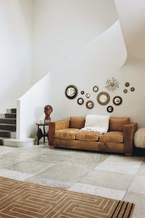
An iconic 1930s Jean-Michel Frank sofa beneath Line Vautrin mirrors.
Years ago, I think 1980, when San Francisco's Academy of Art opened their very first class on interior design (the prototype that led to over half the school's curriculum on interior design) I enrolled in the class. I was already at the Academy on a full grant I had won for being sort of talented and sort of cute. As far as I could tell, the grant was unlimited as long as I appealed to them, but I lost my hots for them first and stopped showing up. I was sort of stupid too.
Anyway. In their first ever decorating class the instructor told us to disregard magazines like Architectural Digest because they only publish the homes of very wealthy people and no normal person could possibly live like that. I disagreed and still do. True, you and I can never afford an Alexander Calder mobile in our living room, but why can't we make one? Isn't creativity what it's all about? We just need to know the basics of design to make that creativity effective. Everything I know about design I've learned by studying pictures over and over until I see, really see, every element of a room - the colors, the light, the patterns, the textures, the shapes, the lines, the form, the function, the mood and the interaction of it all. The big league designers aren't big for nothing. They're in hotshot magazines because they're smart. If we're smart, we can learn from them. Why learn from mediocre designers when we can learn from the best? Whoever we choose to study, whether in magazines, books, or now on the Internet, it all costs the same. Nothing.
Here's an outrageous example. Vogue's online article about Reed and Delphine Krakoff's 18,000 sq ft Upper East Side Manhattan brownstone. Big place. Filled with museum quality pieces. What could we possibly learn from that? Well, try this on the sliding scale of our own pocketbooks or should I say coin purses:
Throughout the house, the juxtapositions of furnishings, art, and objects of all periods are giddying and exciting. "I think that's why our collection's interesting, because you see so many layers," says Delphine.
The research process is what fuels Reed's collecting. "What's interesting," he adds, "is learning about different periods and what happened in terms of design. It's a never-ending experience, and it really is a historical map for any period."
"That tension is what makes a collection personal as opposed to encyclopedic and disciplined," says Reed. "We collect with our hearts."
Cracking advice for cracking design. Now let's have a look at the pictures and see which elements we can transfer to our own homes. Theirs might be worth a fortune, but the basic principles of its design could apply to a uh.. trailer.
Vogue : Reed and Delphine Krakoff : Design For Living
Delphine Krakoff, wearing Reed Krakoff, with her daughter Lily. Al Held's Black and White VII painting and Marc Newson's 1986 Lockheed chaise longue.

Alexander Liberman's dot painting hangs above Garouste & Bonetti's console and chairs and a flock of Lalanne sheep in the entrance hall.
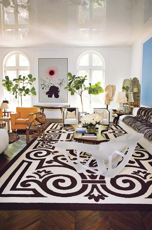
In the living room, Joris Laarman's 2006 translucent chaise sits on a c. 1940 Cogolin rug designed by Henri Gonse.
In the master bathroom, a pair of Louis XVI marquises made by Georges Jacob flank a 1930s Jean-Michel Frank vellum waterfall table. Serge Roche's 1955 mirror.
Reed Krakoff in the living room, in front of Alexander Calder's 1971 wall mobile Two Black Discs and Six Others.


